That meeting. The one where you share your screen, ready to drop a bombshell insight you spent a week uncovering. You point to the chart, the numbers, the trendline. And then, nothing.
The air goes out of the room. You get the polite, vacant stares. You’ve presented a fact, but you failed to make a connection.
Let’s be brutally honest: no one cares about your data as much as you do. They care about what it means for them. Your data is a fact. But a fact doesn’t change minds. A story does.
This is the whole game of visual storytelling with data. It’s not a soft skill; it’s a power tool for engaging non-technical audiences with data and making things happen.
The Only Three Rules You Need
Forget everything else. If you want to master data storytelling for non-technical stakeholders, you just need to do these three things.
Rule #1: Lead with the “So What?”
Before you make a single chart, you must be able to answer the question: “Why should anyone in this room care?”
The Head of Product doesn’t care about your cohort analysis. She cares that a new feature is confusing 30% of new users and killing your activation rate. Frame it that way. You have to simplify data for non-technical audiences by getting straight to the point.
Try this: Before your next meeting, write down one sentence that starts with: “This matters because…” If you can’t finish that sentence in simple, powerful terms, you’re not ready to present.
Rule #2: Build a Bridge, Not a Report
Data is a destination. Your audience is on the other side of a river of confusion. Your job is to build them a bridge. The simplest bridge is a story.
- The Normal: “Here’s where we were.”
- The Explosion: “Then, this happened.”
- The New Normal: “Here’s what it means, and what we should do now.”
This is how you create contextual data narratives that people can follow.
Try this: Find a simple analogy. Is your sales funnel a “leaky bucket”? Is your user journey a “traffic jam”? Is a process bottleneck a “weak link in a chain”? Use it. An analogy is a shortcut to understanding and a key part of using analogies and metaphors in data storytelling.
Rule #3: Design for a Glance, Not a PhD
Your visuals should pass the 5-second test. Can someone look at your chart for five seconds and get the main idea? If not, it’s too complicated.
This is where data visualization best practices become critical.
- Be a Ruthless Editor: Kill the gridlines. Kill the 3D effects. Kill every label that isn’t absolutely necessary. Clean visuals are impactful business data visuals.
- Use Color Like a Surgical Tool: Don’t use it like a paint bomb. Use muted colors (like gray) for the context and one bright, bold color to highlight your key finding. It’s a spotlight. This is how you improve stakeholder understanding with clear data visuals.
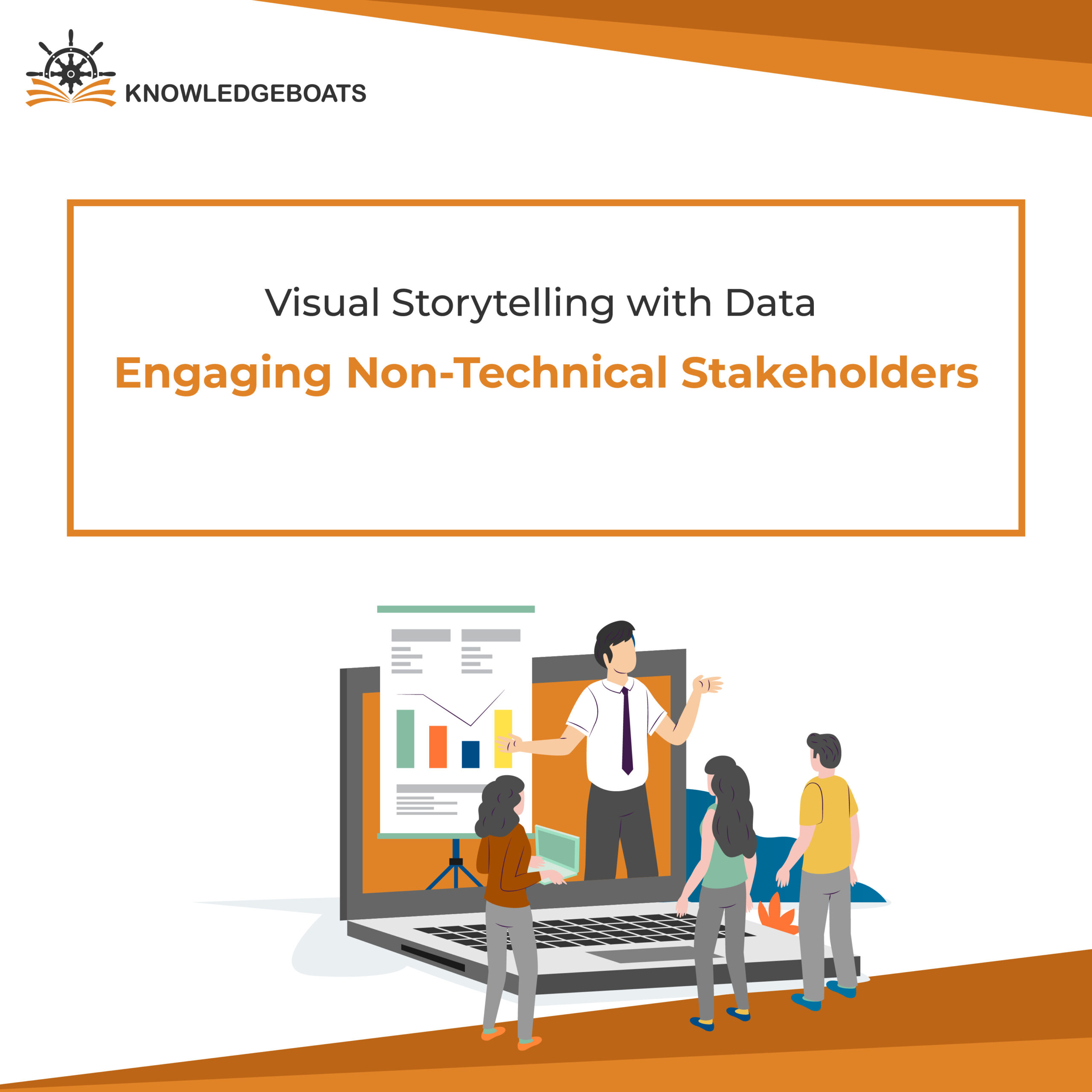
Putting It to Work
A great dashboard is a story, not a graveyard for charts. It answers questions. It doesn’t just display data. Look at examples of engaging dashboards for business leaders, they’re clean, focused, and guide your attention.
Better yet, let people touch the data. Creating interactive visuals to engage executives is your secret weapon. The most powerful insight is the one they discover themselves. When the VP clicks a filter and says, “Aha, I see the problem,” you haven’t just shared data. You’ve created an ally.
Ultimately, your job is to be a translator. A bridge between the cold language of data and the warm, human language of decisions. You need to bridge analytics and intuition with visual narratives.
So, the next time you’re staring at a spreadsheet, ask yourself the most important question:
What story does my data really want to tell?